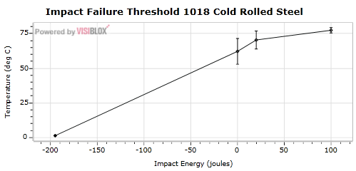
Having spent a number of years studying Physics at university, I have had the importance of error bars well and truly drummed into me! Within physics, or any experimental science, there are always going to be errors in the measurements you make. The more repeat measurements you make, the more confident you can be in the mean value, however you cannot remove the errors altogether. Error bars provide a way to represent the spread of experimental observations graphically, without them, it is hard to have any confidence in the conclusions drawn from the observations!
In this blog post I will show how to implement a custom Visiblox chart series to render error bars:

(The data in the above chart is from a page which details how to calculate the standard error from experimental results).
Creating a Custom Series
As described in my previous blog post on creating a spline series, to create a new series type, you sub-class one of the Visiblox base-classes, in this case MultiValueSeriesBase is a suitable starting point:
public class ErrorBarSeries : MultiValueSeriesBase
{
  protected override FrameworkElement CreatePoint(IDataPoint dataPoint)
  {
    throw new NotImplementedException();
  }

  protected override void RenderDataLabels()
  {
    throw new NotImplementedException();
  }
}
I don't want data labels, so the only method I need to implement is CreatePoint, which takes the (multi-valued) point to be rendered as its only argument. The lifecycle of point creating and destruction is taken care of by the base-class.
The IDataPoint has a string indexer which is used to retrieve multiple Y values for multi-valued series. It is a good idea to define these in a single place, here we define the three y-values required for an error-bar series:
public static readonly string ErrorUp = "ErrorUp";

public static readonly string ErrorDown = "ErrorDown";

public static readonly string Value = "Value";
The CreatePoint implementation for this series creates a Path as follows:
protected override FrameworkElement CreatePoint(IDataPoint dataPoint)
{
  var lineGeometry = BuildGeometry(dataPoint);

  Path line = new Path();
  line.Stroke = new SolidColorBrush(Colors.Black);
  line.Fill = new SolidColorBrush(Colors.Gray);
  line.StrokeThickness = 1.0;
  line.StrokeLineJoin = PenLineJoin.Bevel;
  line.Data = lineGeometry;
  line.SetValue(ZoomCanvas.IsScaledPathProperty, true);

  return line;
}
The BuildGeometry method does most of the work, extracting the values from the IDataPoint, transforming them (via the axis) to the required coordinate system, then creating a suitable geometry:
/// <summary>
/// Creates the geometry for the given datapoint
/// </summary>
private PathGeometry BuildGeometry(IDataPoint dataPoint)
{
  var halfWidth = SuggestedPointWidth * WidthFactor;

  // obtain the data values
  var topDataValue = dataPoint[ErrorUp] as IComparable;
  var middleDataValue = dataPoint[Value] as IComparable;
  var bottomDataValue = dataPoint[ErrorDown] as IComparable;

  // convert to a the required render coordinates
  double topRenderPos = YAxis.GetDataValueAsRenderPositionWithoutZoom(topDataValue);
  double middleRenderPos = YAxis.GetDataValueAsRenderPositionWithoutZoom(middleDataValue);
  double bottomRenderPos = YAxis.GetDataValueAsRenderPositionWithoutZoom(bottomDataValue);

  double xMiddleRenderPos = XAxis.GetDataValueAsRenderPositionWithoutZoom(dataPoint.X);
  double xRightRenderPos = xMiddleRenderPos - halfWidth;
  double xLeftRenderPos = xMiddleRenderPos + halfWidth;

  // build a suitable gemoetry
  PathGeometry lineGeometry = new PathGeometry();

  PathFigure upperVerticalLine = CreateLineFigure(
    new Point(xMiddleRenderPos, middleRenderPos - halfWidth),
    new Point(xMiddleRenderPos, topRenderPos));
  lineGeometry.Figures.Add(upperVerticalLine);

  PathFigure lowerVerticalLine = CreateLineFigure(
    new Point(xMiddleRenderPos, bottomRenderPos),
    new Point(xMiddleRenderPos, middleRenderPos + halfWidth));
  lineGeometry.Figures.Add(lowerVerticalLine);

  PathFigure upperBar = CreateLineFigure(
    new Point(xLeftRenderPos, topRenderPos),
    new Point(xRightRenderPos, topRenderPos));
  lineGeometry.Figures.Add(upperBar);

  PathFigure lowerBar = CreateLineFigure(
    new Point(xLeftRenderPos, bottomRenderPos),
    new Point(xRightRenderPos, bottomRenderPos));
  lineGeometry.Figures.Add(lowerBar);

  PathFigure center = CreateLineFigure(
    new Point(xMiddleRenderPos - halfWidth, middleRenderPos),
    new Point(xMiddleRenderPos, middleRenderPos + halfWidth),
    new Point(xMiddleRenderPos + halfWidth, middleRenderPos),
    new Point(xMiddleRenderPos, middleRenderPos - halfWidth)
  );
  lineGeometry.Figures.Add(center);

  return lineGeometry;
}

/// <summary>
/// Create a line figure that connects the given points
/// </summary>
private PathFigure CreateLineFigure(params Point[] points)
{
  // add all the points (except the first)
  var pointCollection = new PointCollection();
  foreach (var point in points.Skip(1))
  {
    pointCollection.Add(point);
  }

  // create a figure, using the first point as the StartPoint.
  return new PathFigure()
  {
    IsClosed = true,
    StartPoint = points.First(),
    Segments = new PathSegmentCollection()
    {
      new PolyLineSegment
      {
        Points = pointCollection
      }
    }
  };
}
We can now create an instance of this series in XAML:
<vis:Chart x:Name="chart">
  <vis:Chart.Series>
    <local:ErrorBarSeries/>
  </vis:Chart.Series>
</vis:Chart>
Supplying data to the chart via MultiValuedDataPoint as follows:
public MainPage()
{
  InitializeComponent();

  var data = new DataSeries<double, double>();
  data.Add(CreatePoint(-195, 1.4, 0.2));
  data.Add(CreatePoint(0, 62.2, 9.3));
  data.Add(CreatePoint(20, 70.4, 6.5));
  data.Add(CreatePoint(100, 77.4, 1.9));

  chart.Series[0].DataSeries = data;
}

private MultiValuedDataPoint<double, double> CreatePoint(double x, double y, double error)
{
  var point = new MultiValuedDataPoint<double, double>(x,
    new Dictionary<object, double>()
    {
      { ErrorBarSeries.ErrorUp, y + error },
      { ErrorBarSeries.ErrorDown, y - error },
      { ErrorBarSeries.Value, y }
    });
  return point;
}
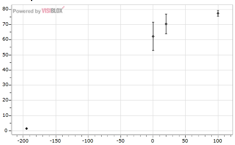
This results in the following chart:

Binding to a Multi-valued Series
In the previous example we created instances of MultiValuedDataPoint, a Visiblox type for representing multi-valued points. As an alternative, we can create model objects to represent each point, rendering them in the chart via databinding.
We first modify the code to create a collection of Measurement instances (a simple model object that implements INotifyPropertyChanged):
public MainPage()
{
  InitializeComponent();

  var data = new ObservableCollection<Measurement>();
  data.Add(CreateMeasurement(-195, 1.4, 0.2));
  data.Add(CreateMeasurement(0, 62.2, 9.3));
  data.Add(CreateMeasurement(20, 70.4, 6.5));
  data.Add(CreateMeasurement(100, 77.4, 1.9));
  this.DataContext = data;
}

private Measurement CreateMeasurement(double x, double y, double error)
{
  return new Measurement()
    {
      XValue = x,
      YValue = y,
      YValueErrorUp = y + error,
      YValueErrorDown = y - error
    };
}
The markup for the chart is modified to use a BindableDataSeries, with bindings specified for the various component of the error bar series. Also, the ItemsSource of the BindableDataSeries is bound to the inherited DataContext:
<local:ErrorBarSeries>
  <local:ErrorBarSeries.DataSeries>
    <vis:BindableDataSeries ItemsSource="{Binding}"
                            XValueBinding="{Binding XValue}">
      <vis:BindableDataSeries.YValueBindings>
        <vis:YValueBinding YValueKey="Value" Binding="{Binding YValue}"/>
        <vis:YValueBinding YValueKey="ErrorUp" Binding="{Binding YValueErrorUp}"/>
        <vis:YValueBinding YValueKey="ErrorDown"  Binding="{Binding YValueErrorDown}"/>
      </vis:BindableDataSeries.YValueBindings>
    </vis:BindableDataSeries>
  </local:ErrorBarSeries.DataSeries>
</local:ErrorBarSeries>
We can also display our data in a DataGrid, allowing us to manipulate the values (not that I condone manipulation of scientific data!), with the changes being reflected in the chart:
<sdk:DataGrid Grid.Row="1"
              x:Name="grid"
              ItemsSource="{Binding}"/>
This gives us the following application:
You can edit the values, with the changes reflected immediately in the chart above.
You can download the sourcecode for the above example here: VisibloxErrorBarSeries.zip
Regards, Colin E.
